 By Medium -
2020-10-21
By Medium -
2020-10-21
Object-Oriented UX (OOUX) fell into my lap a couple years ago during a brief Lunch and Learn at work. At the time, I was still getting my feet wet in UX, but I knew this OOUX stuff was on to…
 By Medium -
2021-02-19
By Medium -
2021-02-19
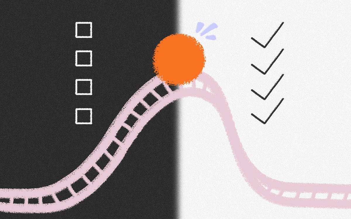
A few years ago, one of my children became obsessed with roller coasters. He watched video after video to study them from afar. He designed his own in computer games. There was just one problem: He…
 By Ideas -
2021-01-22
By Ideas -
2021-01-22
Web design is a tricky subject, with a lot of things to take into account. Use this guide to ensure you’re designing best-in-class web pages and websites.
 By CSS-Tricks -
2020-12-03
By CSS-Tricks -
2020-12-03
Our comprehensive guide to CSS flexbox layout. This complete guide explains everything about flexbox, focusing on all the different possible properties for the parent element (the flex container) and ...
 By workshopper -
2020-12-15
By workshopper -
2020-12-15
Prototyping - it's arguably the most exciting phase in design thinking. It's where the ideas meld together and a sample model is created to detail the components of the final product. With so many pro ...
 By Medium -
2021-03-06
By Medium -
2021-03-06
It isn’t a mystery that a large part of delivering a highly successful user experience is understanding what the customer wants/needs along with the cognition that consequently gets customers…
