 By Medium -
2020-12-16
By Medium -
2020-12-16
Dark UIs can be stylish, dramatic, and elegant. But despite the potential benefits, they come with many challenges and potential pitfalls.
 By Medium -
2020-09-01
By Medium -
2020-09-01
Material Theming is a way to customize Material Components to align with your brand. A Material theme includes color, typography and shape parameters which you can adjust to get near-infinite…
 By Medium -
2020-11-27
By Medium -
2020-11-27
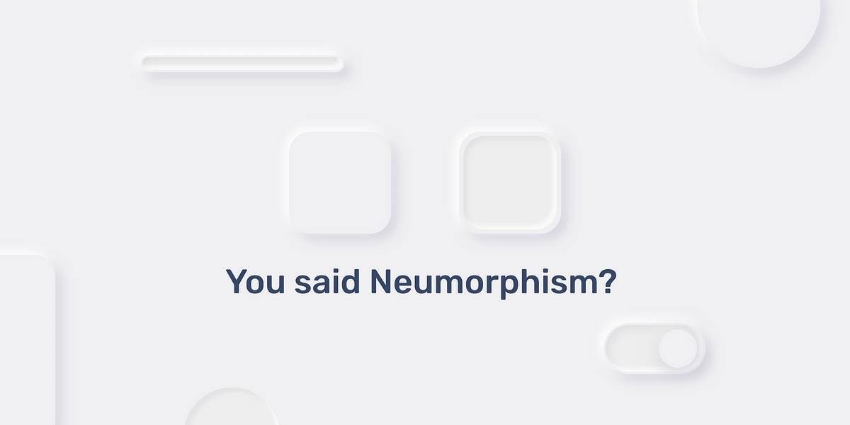
Became viral a few months ago, Neumorphism has emerged as a must-have interface design for all designers. The term Neumorphism refers to an approach that uses a combination of highlights and shadows…
 By Medium -
2021-03-09
By Medium -
2021-03-09
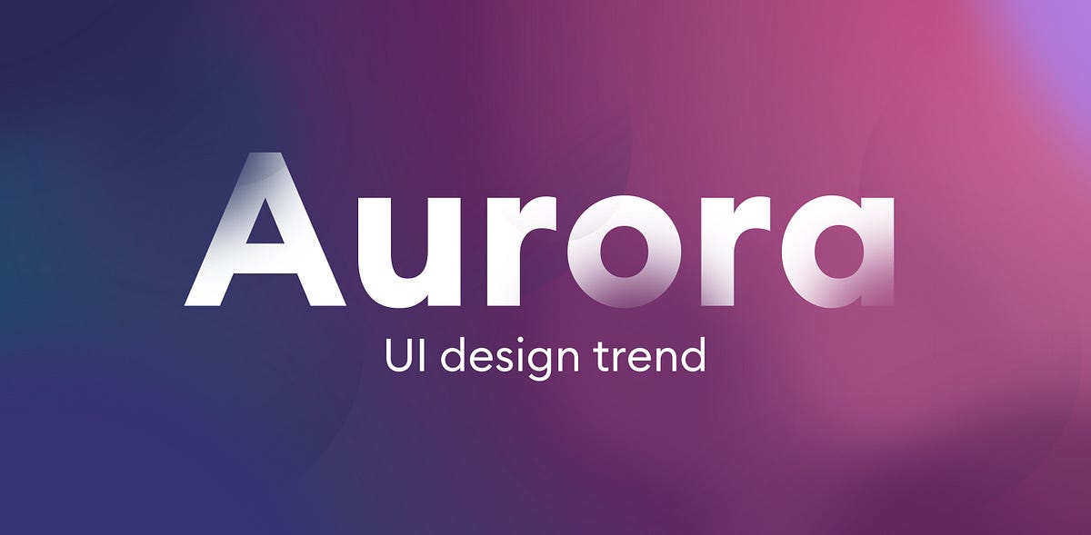
UI design and especially its more artistic, visual side is constantly evolving. While most current products repeat the same, trusted and well-known IA patterns, UI and the Value Proposition are the…
 By Medium -
2021-02-26
By Medium -
2021-02-26
These 10 essential tools help UX writers and content designers resonate with their audience.
 By Elementor Blog -
2020-12-21
By Elementor Blog -
2020-12-21
The 2021 web design trends review is here! Learn about 13 web design trends for 2021 by seeing how top design experts use them in their websites.
