 By Medium -
2020-12-08
By Medium -
2020-12-08
As a designer, you should use high contrast colors. It will help users of websites and apps to perceive the content, regardless of visual impairments, technical restrictions, and external influences…
 By Elementor Blog -
2020-12-21
By Elementor Blog -
2020-12-21
The 2021 web design trends review is here! Learn about 13 web design trends for 2021 by seeing how top design experts use them in their websites.
 By Medium -
2020-12-02
By Medium -
2020-12-02
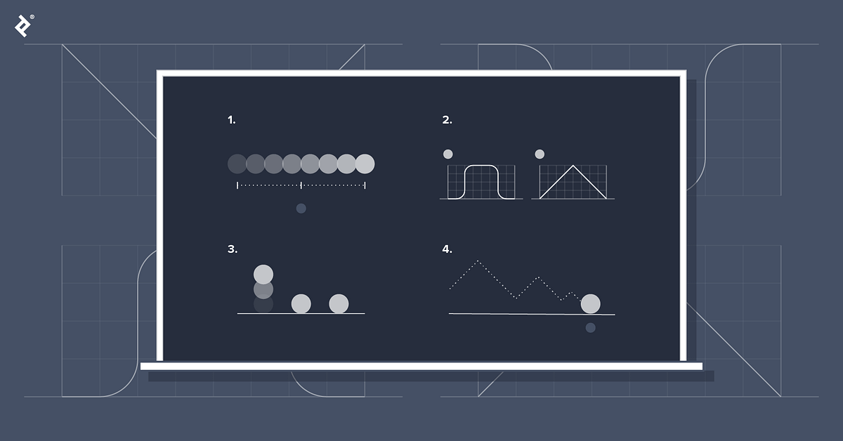
Our world is one of movement. Even in still moments, leaves tremble and lungs expand. In the realm of digital product design, it would seem that motion is second nature, an extension of the everyday…
 By Medium -
2021-03-09
By Medium -
2021-03-09
UI design and especially its more artistic, visual side is constantly evolving. While most current products repeat the same, trusted and well-known IA patterns, UI and the Value Proposition are the…
 By Ideas -
2021-01-22
By Ideas -
2021-01-22
Web design is a tricky subject, with a lot of things to take into account. Use this guide to ensure you’re designing best-in-class web pages and websites.
 By Medium -
2020-12-08
By Medium -
2020-12-08
In a month we will (finally!) say goodbye to the not-so-cool year 2020. Since my previous article about trends was quite successful, I took some time and did some industry research, to create a 2021…
