/GettyImages-1151577420-0a1caa7c85a34411820816f7653c3c58.jpg) By Investopedia -
2021-02-05
By Investopedia -
2021-02-05
Algorithmic trading provides a more systematic approach to active trading than one based on intuition or instinct. Here’s how it works.
 By Medium -
2020-11-20
By Medium -
2020-11-20
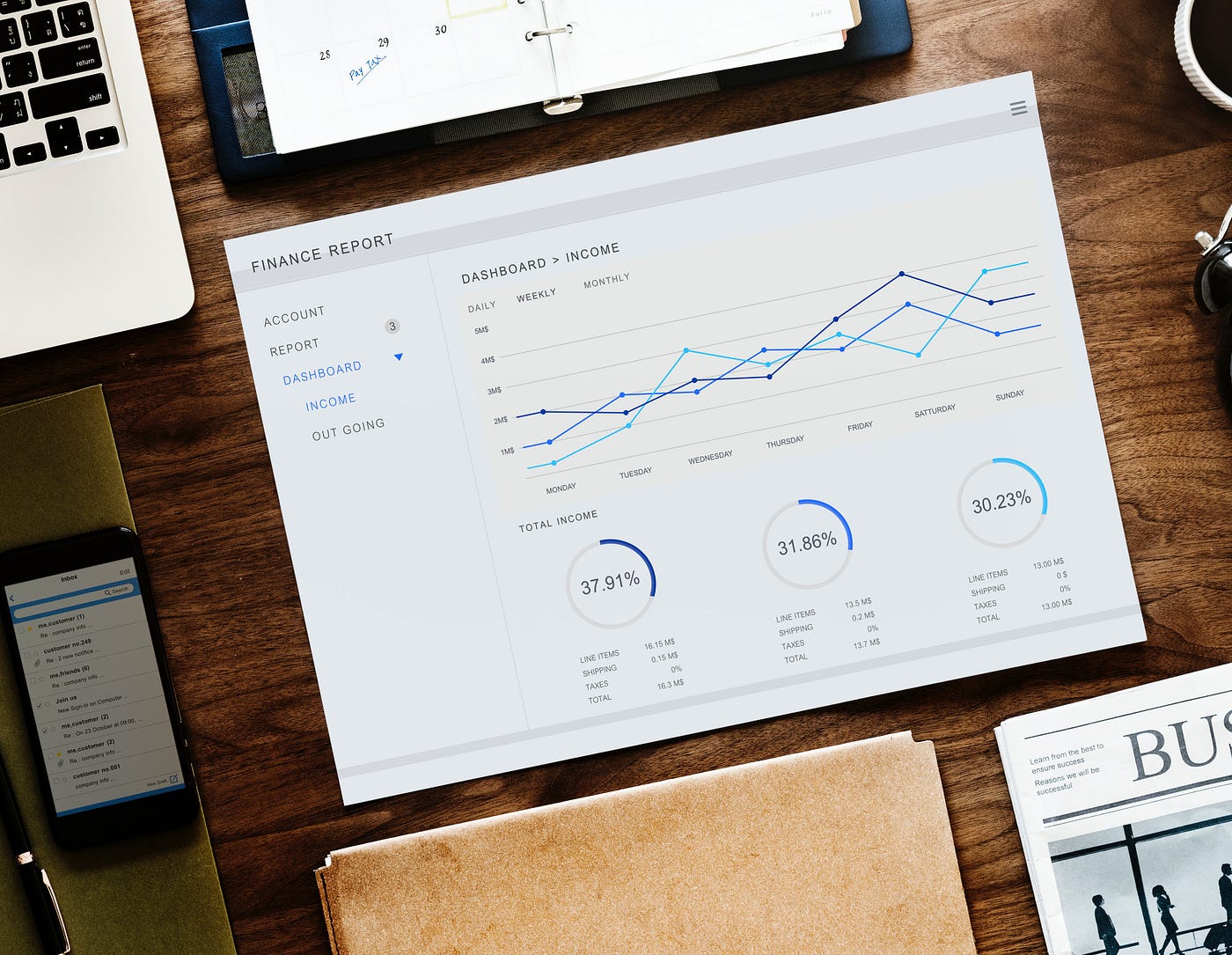
Executing trades in the financial market has been made extremely accessible. With a few hundred $ and an internet connection you have the whole world under your thumb. This makes it seem that trading…
 By KDnuggets -
2021-01-23
By KDnuggets -
2021-01-23
Learn how to develop a LSTM neural network with PyTorch on trading data to predict future prices by mimicking actual values of the time series data.
 By DataCamp Community -
2021-02-05
By DataCamp Community -
2021-02-05
PYTHON for FINANCE introduces you to ALGORITHMIC TRADING, time-series data, and other common financial analyses!
 By Medium -
2020-12-14
By Medium -
2020-12-14
What is it, how does it help, tools used and an experiment
 By Medium -
2021-03-14
By Medium -
2021-03-14
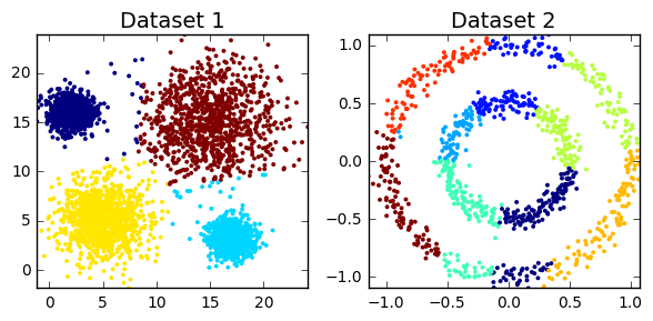
In the first part of this article, I provided an introduction to hierarchical time series forecasting, described different types of hierarchical structures, and went over the most popular approaches…